


STARSCREEN: SMC Consulting
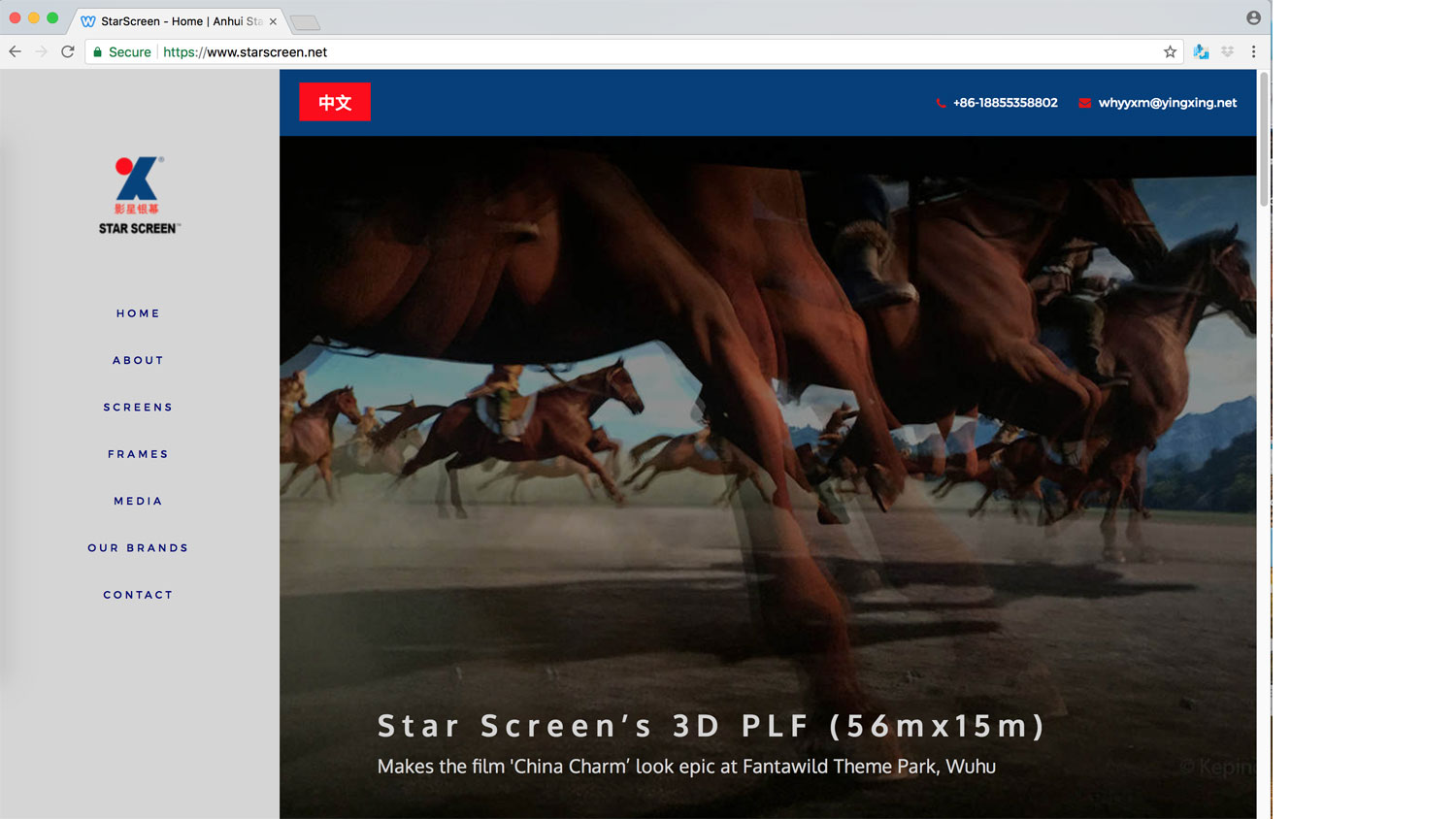
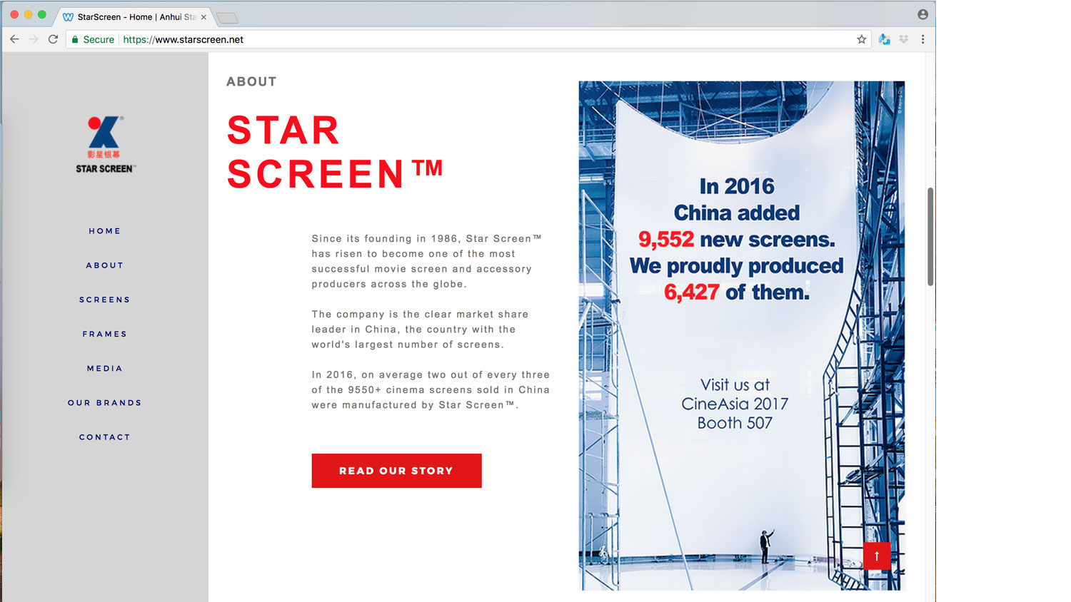
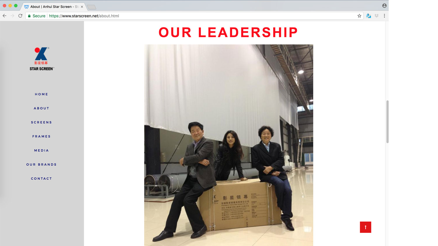
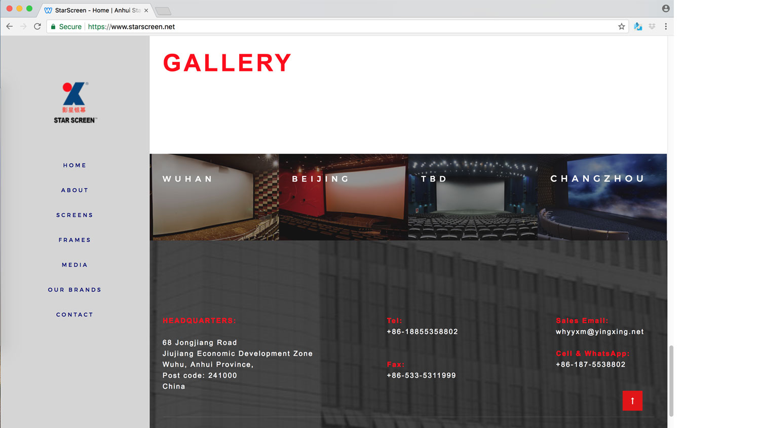
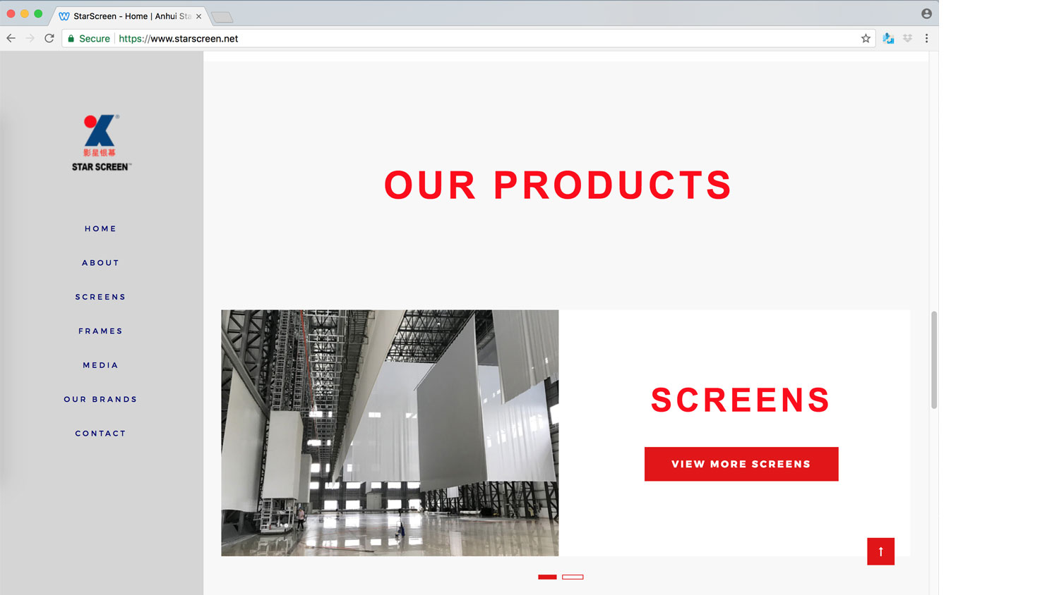
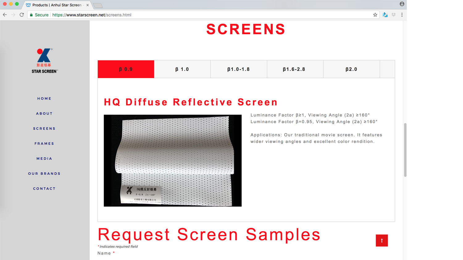
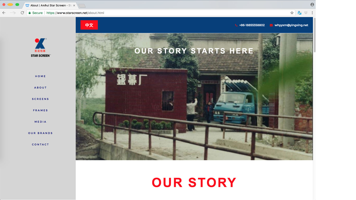
Collaborated with the marketing and design team of SMC Consulting with initial comps for the re-design of their website for the western market.
New Site with English version: https://www.starscreen.net/
Old site with English version: http://www.yingxing.net/?LanguageAlias1=en
Challenge: Starscreen is a movie screen manufacturer in China who dominates the Chinese market. Their website is designed for the Asian markets and is bi-lingual, English and Chinese. Starscreen attends the CinemaCon trade shows in the western hemisphere to support their clients located in Europe and the USA. But, their website design and content is not marketed correctly to the western community.
Solution: Starscreen had a second website created for the western community who was attending CinemaAsia in 2017. This website has less content and is more user friendly. The overall design is more modern and engaging for the western market.
THORIUM DIGITAL LLC: Ziopharm Oncology
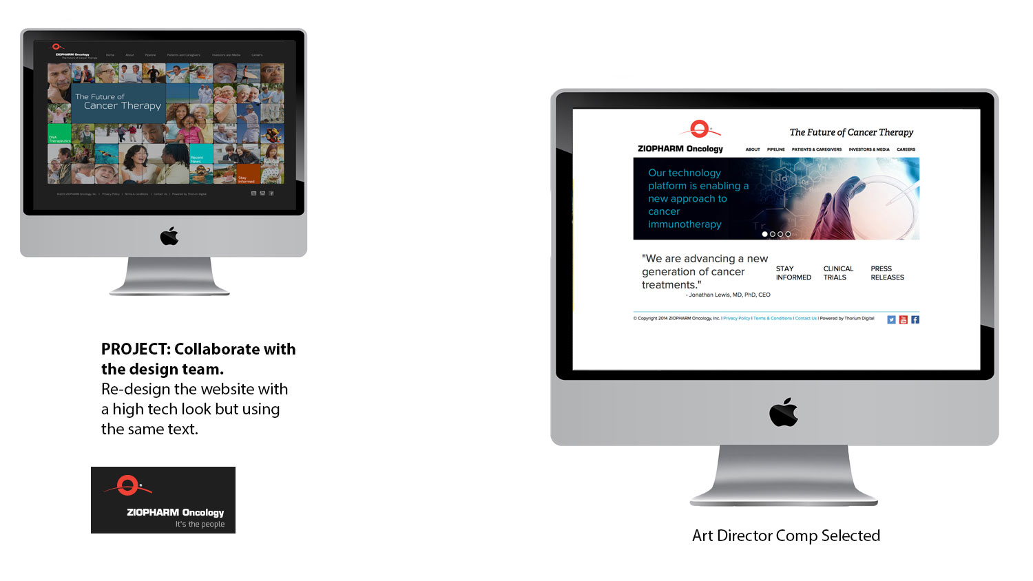
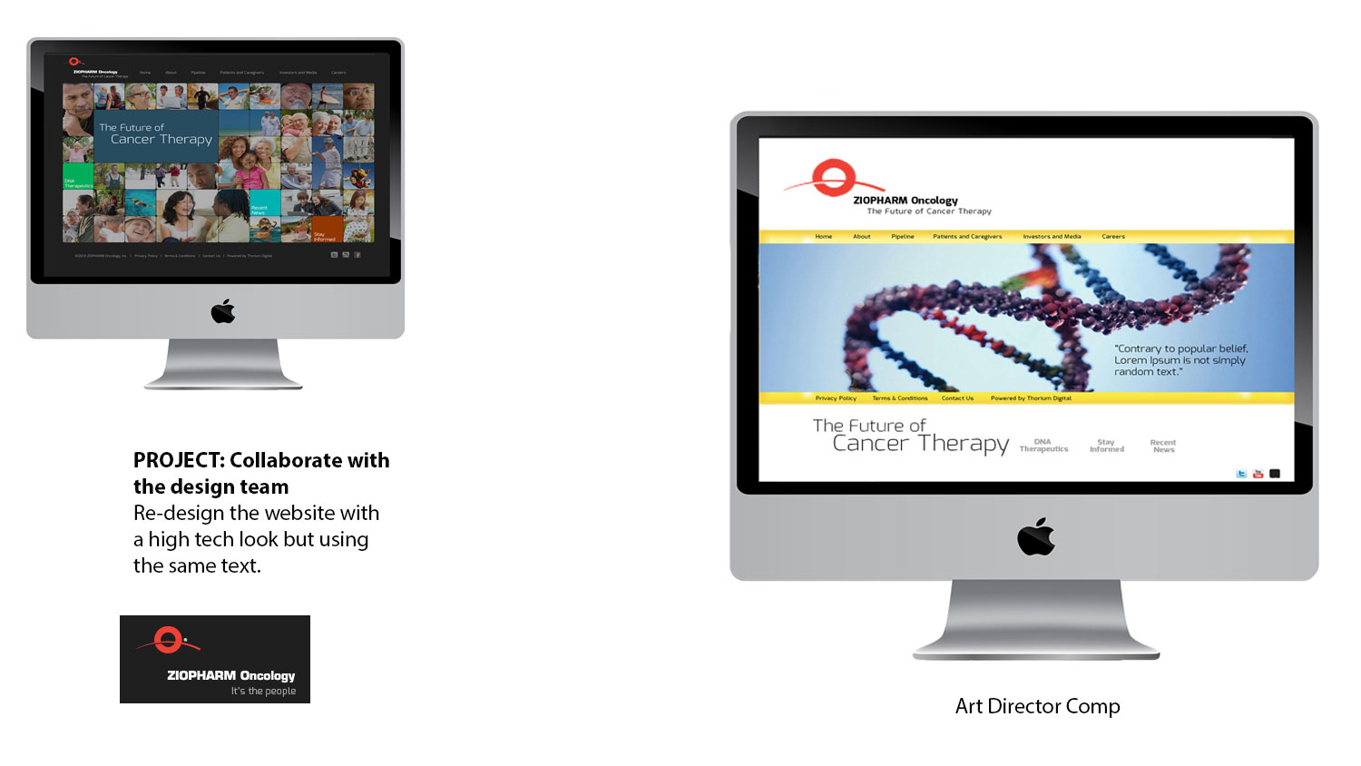
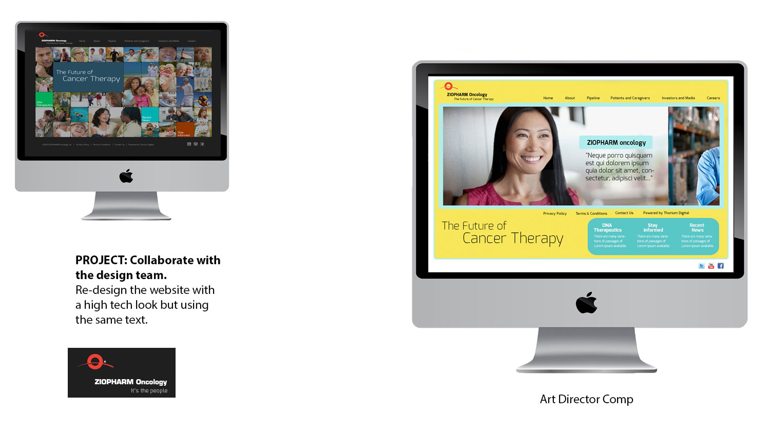
Pitched with other Web Designers with the redesign of Ziopharm Oncology website for Thorium Digital LLC. using the Adobe Creative Suite applications. Attended conference call meeting with other designers and members of the Thorium Digital team.
I was one of the web designers hired to design several comps for the redesign of their biotech clients’ website.
Challenge: The client wanted to redesign the site with a more contemporary and hi-tech look resembling the feel of leading technology corporate websites. I was instructed to use the same content as the prior website but with different imagery. One comp needed to have a white background and the other a colored background.
Solution: On the home page I replaced the grid of photos with a slideshow. I used patient images that did not resemble the ones used on typical pharmaceutical drug sites. For one of my comps I used a photo of a glass DNA strand instead of one that depicted a scientific look and a circular icon that represented the DNA cells. One comp had a white background and the other used shades of green and yellow. The last comp removed the DNA icons and included one image sized to the width of the page in the slideshow
Cre&tive Branding, LLC
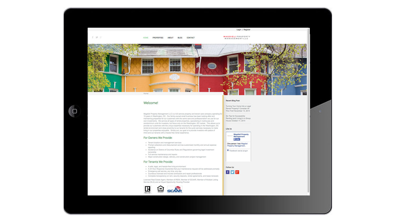
Used WordPress CMS template to design a website for Magdieli Property LLC for Cre&tive Branding, LLC
http://magdielipropertymanagement.com
Challenge: As a former house tenant to the Washington DC area, Amit Magdieli desired to become a landlord who offered services that he did not receive as a tenant. His interests in construction, art, architecture enabled him to envision the design, aesthetics and construction needed to convert or renovate properties. Amit Magdieli is the founder and property manager for Magdieli Property Management Inc. For over 15 years, Magdieli Property Management has converted row houses into multi-unit and group rental properties in the Washington DC area.
Solution: A responsive design website and blog was created. The content of this website and blog is informative and
SEO friendly. Prospective tenants have access to posts by current tenants. Each property is displayed with images and information about their amenities.
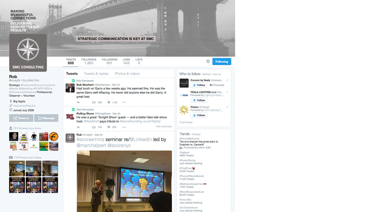
SMC CONSULTING: Web Designer & Developer
http://www.smcconsulting.biz
Challenge: SMC has a seasoned team with a unique combination of experience and expertise successfully serving dozens of small to medium-sized clients with a wide array of customized and comprehensive services including:
• Strategic Communications
• Public Relations
• Investor Relations
• Targeted Marketing
• Business Development
• Artist/Entrepreneur Management + Representation
• Capital Raising
• Crisis Communication
• Multi Media Content Creation
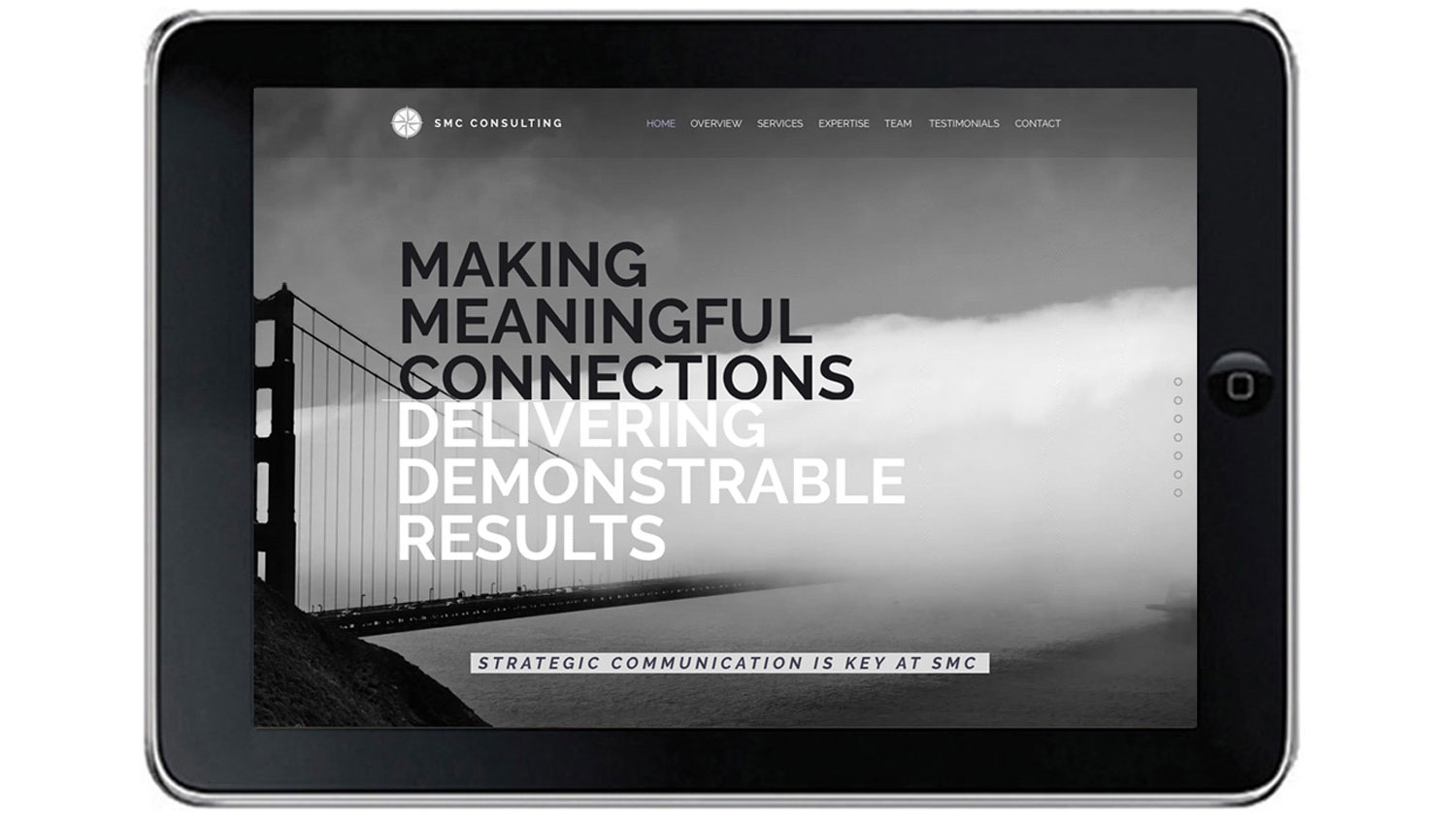
Solution: Customizing a template to create a website that is clean and easy to understand. Black and white photographs are used to reflect old look of cinematography. Video on home page to engage viewers. Blog of articles published in film journals. Testimonials.
WEBPAGE TESTERS
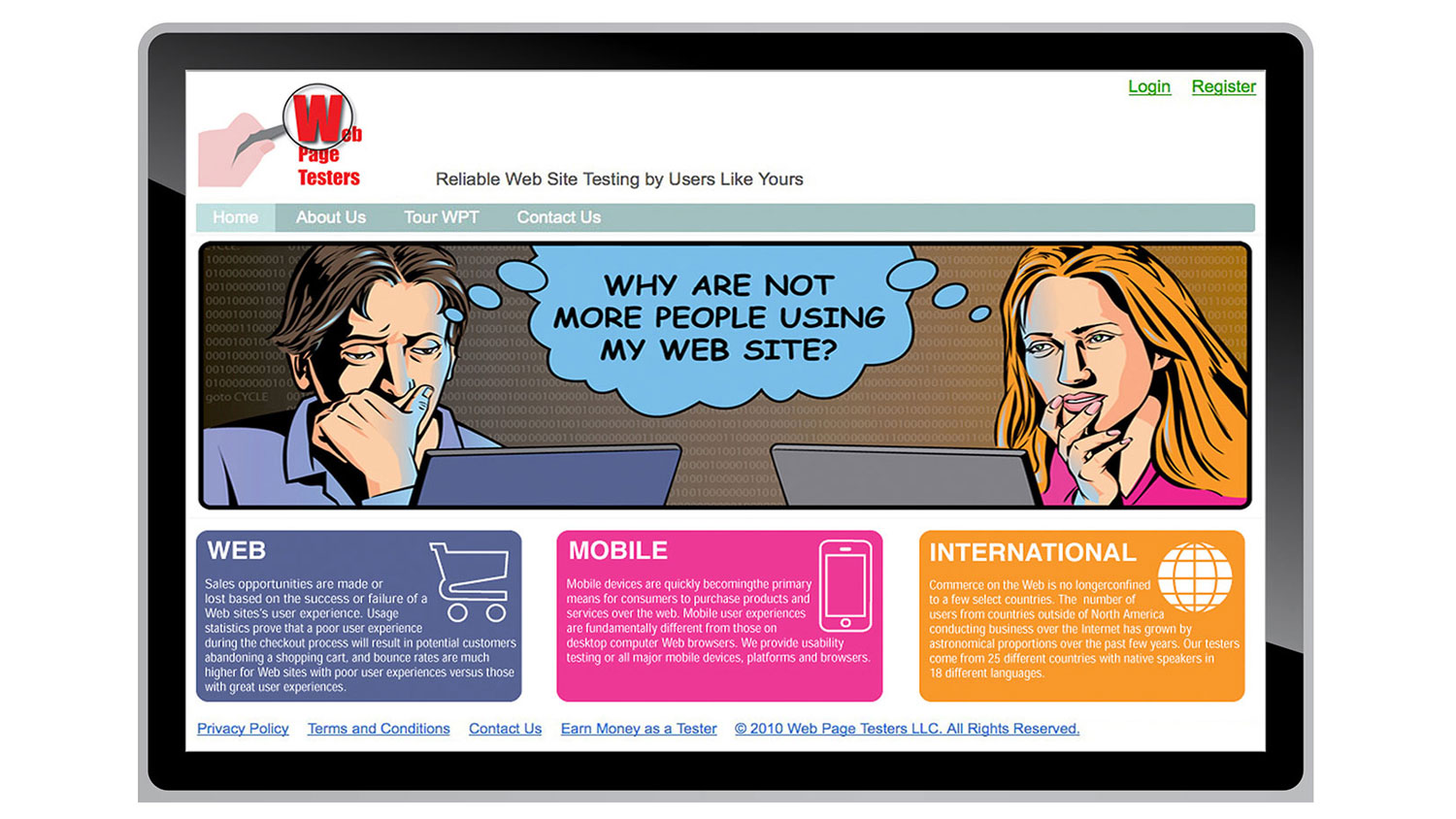
Collaborated with a Product Designer with the website for Webpage Testers. Responsible for the concept and design of the website. Art Directed an illustrator.
Challenge: Their applications analyze and test the access and choices made by users (user experience), URL verification and also assess speed of and response time to various website components.
Not enough companies knew about Webpage Testers capabilities so we needed to expand their awareness on the web. They wanted their website to not resemble a traditional testing site. Those websites have menu screen shots of plug-ins for downloading applications and a wealth of technical content.
Solution: I was asked to design a creative concept relating to the user’s experiences and a depiction of the way the client feels about its users. My design utilized a comic strip theme for the header. Like a police detective, the applications use search tools to detect information about the website. The logo uses a magnifying glass to symbolize these tools and techniques. Infographics were also used for elements relating to the user’s experience with purchases on the web, via mobile devices and through e-commerce, in select countries.
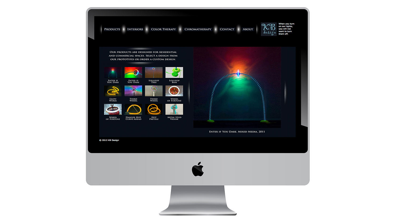
KBDESIGN: www.kbdesign.fluidhosting.com
Designed a website for KB Design using Adobe Dreamweaver and Adobe Flash
Challenge: KB Design designs and markets creative LED lighting solutions using unique materials. Design features include kinetic motion, colored shadow textures or shapes and a rainbow of colors glowing on the wall. The colorful shadows and bulbs alter and enhance the mood. As a form of color therapy these products are also holistic in value.
Solution: The client was marketing her lighting to owners of residential and commercial spaces in the hospitality industries. She wanted an elegant feel for the site so I used the Trajan Pro font and created icons and buttons for the navigation bar and slideshows that cast shadows like lamps. A black background was used since these unique products glow in the dark.
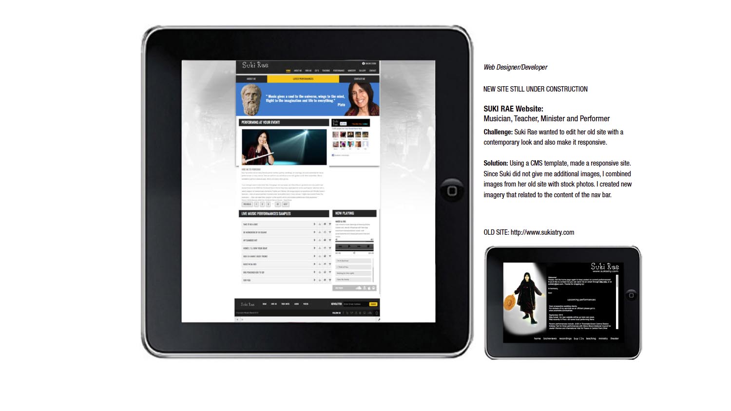
SUKI RAE:
Used a CMS HTML, CSS, Jquery and Javascript template to re-design the website of musician Suki Rae. Site still under construction.
Challenge: To re-design her old site to a more update look and to be able to add more audio and videos to engage the viewer.
Solution: A custom template was used to create her website. Quotes enhanced the imagery. The music could be heard on the website instead of using links to CD Baby.

INDIGO & PYRITE, A Creative Collective, Client: The Fuel Juice Bar
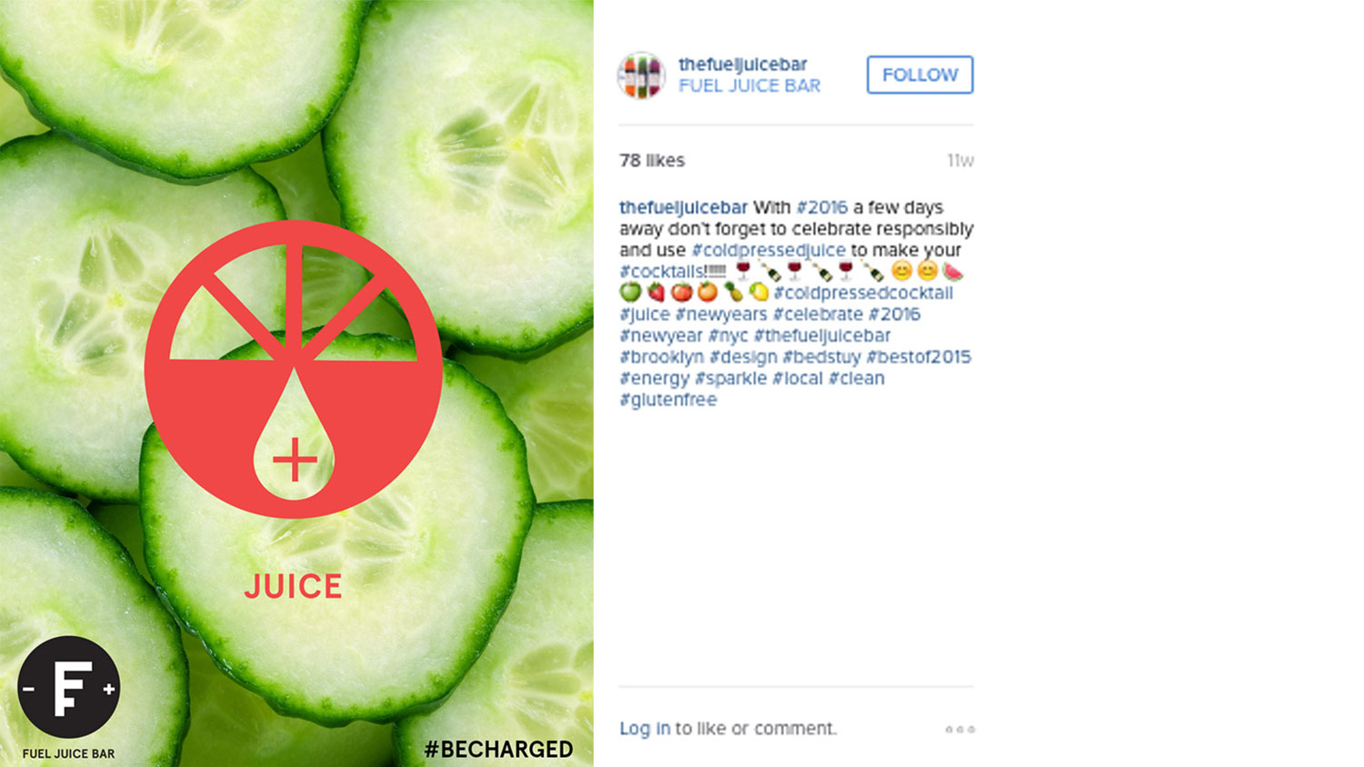
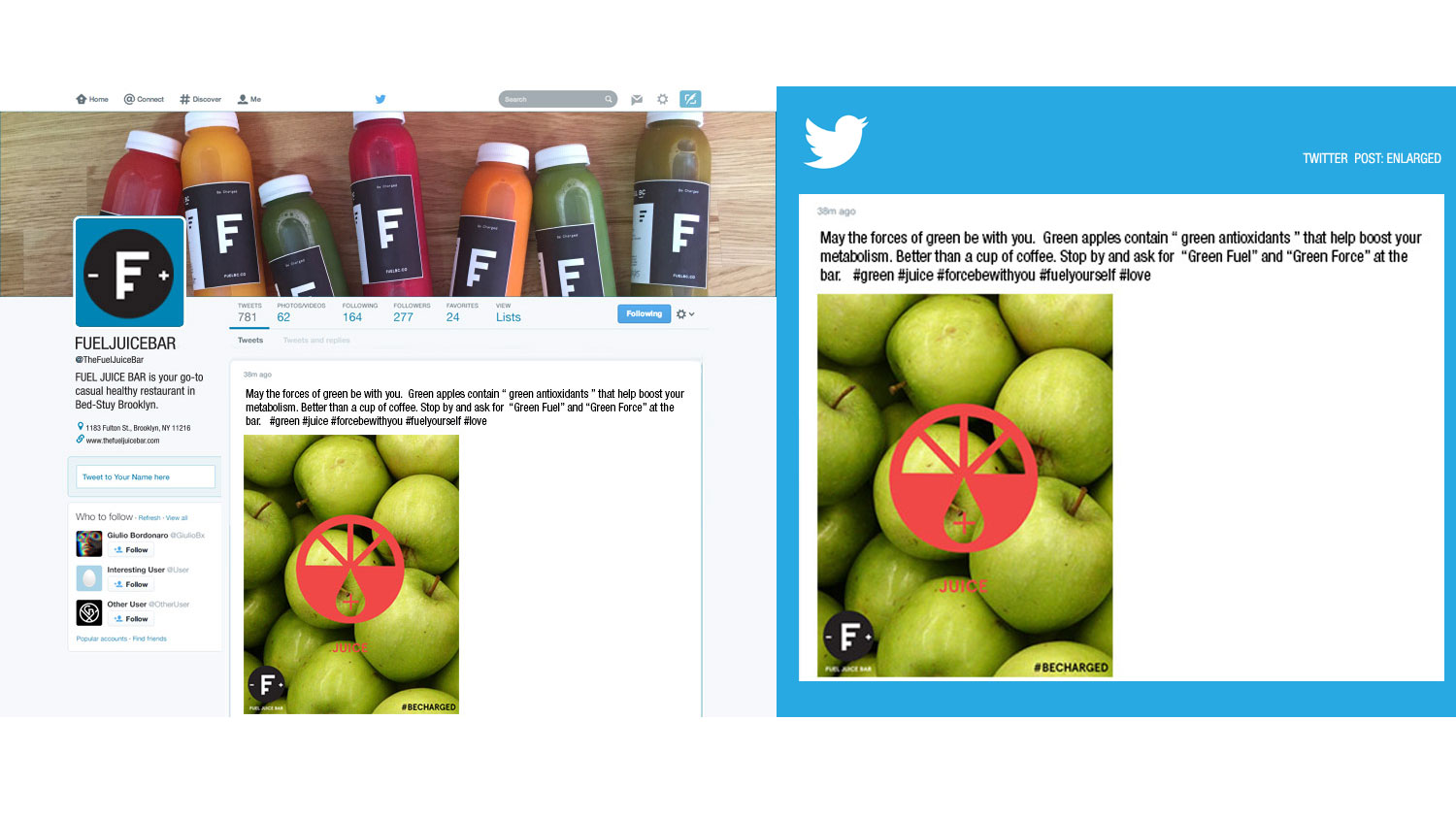
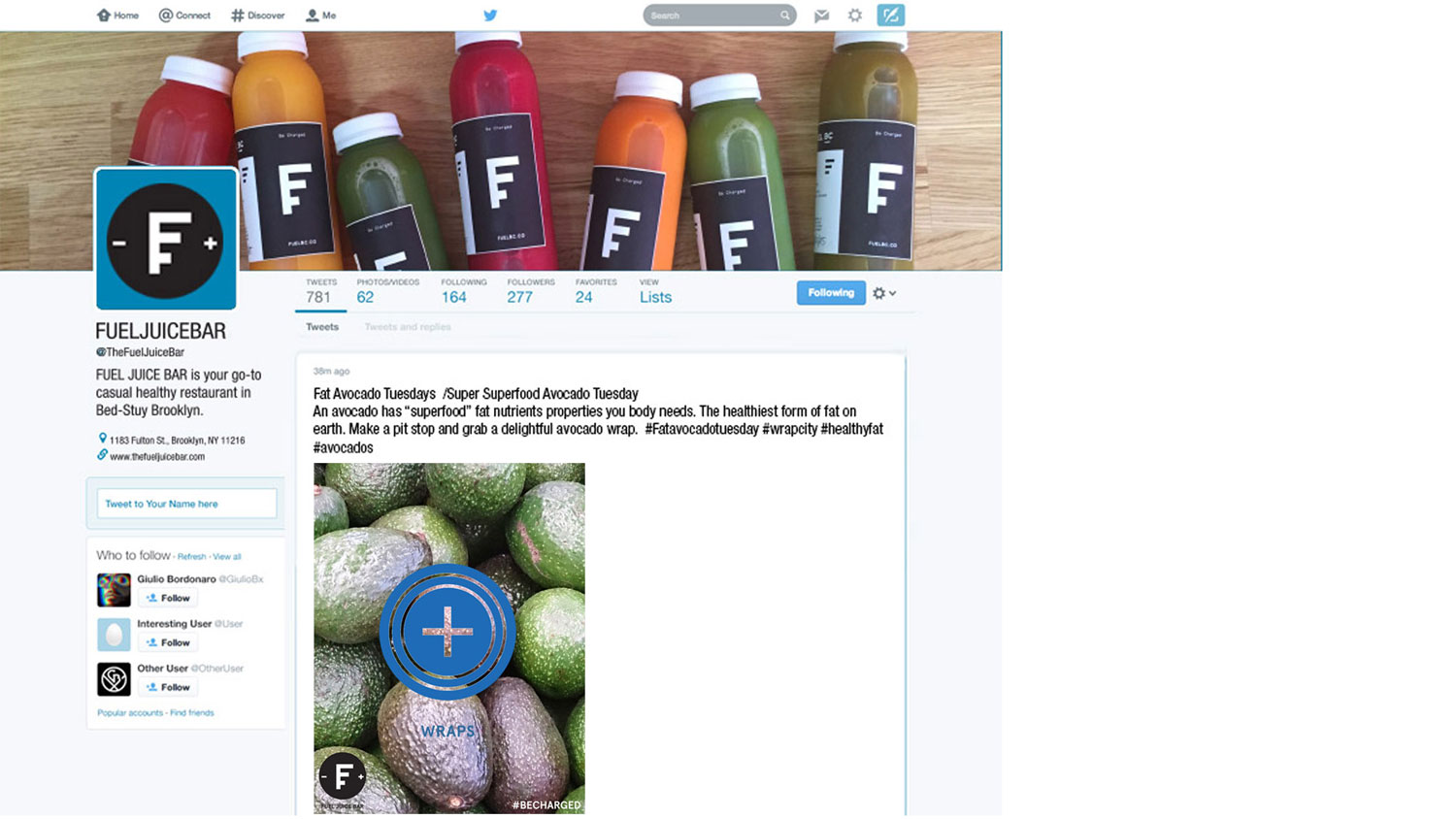
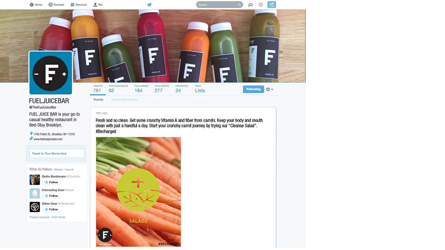
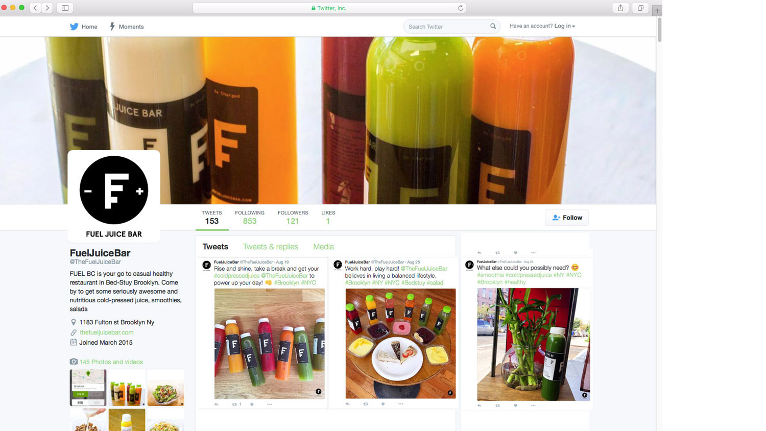
Collaborated with copywriter for their Social Media for Facebook, Instagram & Twitter campaigns.
Challenge: The Fuel Juice Bar is a juice and health food shop in the Bedford Stuyvesant section of Brooklyn. They specialize in cold-pressed juices, smoothies, vegan and raw foods. They opened to offer a new sophisticated, casual, and taste-conscious approach to health focused foods.
They are the latest addition to a growing healthy food market in the Bedford Stuyvesant. Within a ten-block radius, there are two gyms and at least 4 four other shops that offer juices, smoothies, and vegan options, but no raw food options. This is part of the opportunity that presents itself. Most consumers are not familiar with raw foods or its’ health benefits. When consumers eat at The Juice Bar, most are surprised that their food options are raw or vegan. Most of them may enter out of curiosity or for their juice or smoothie options, and then are given samples of their food options. We want to convert them into followers that consider Fuel Juice Bar for breakfast, lunch, and/or dinner and share their experiences on social media.We want to boost Fuel Juice Bar’s presence on social media with compelling posts and/ or campaigns that utilize existing assets and low-barrier executions. Using social media and in-store signage that points to social media we want to make Fuel Juice Bar the go-to place for juices, smoothies, vegan and raw food options.
Solution: Social Media campaigns that present the organic fabric of Brooklyn.These campaigns identify the single most persuasive statement, or compelling visual, and ongoing executions to achieve our objectives and consider existing food images, branding and location images. If possible present executions that can be captured via illustrations. Our team designed an approachable brand that does not talk over the heads of the normal consumer, but talks to them as an ally in their journey to a healthier lifestyle. The tone is casual and educated, and the visuals should be refined and engaging. While there a few local competitors like Jo Juice and Salad Bar, consider brands like Juice Press when thinking about defining the Fuel Juice Bar’s position in the local health food market.

Collaborate with Developers:
• complex coding issues
Knowledge and experience creating, tweaking and trouble shooting websites.
• Wix
• WordPress,
• Dreamweaver
• HTML/CSS, Javascript, PHP, Action Script